Last year I was asked to give a talk to students on the MA Childrens Book Illustration at Anglia Ruskin University. I graduated from the course in 2019 and was thrilled (and a little freaked out) to be asked. The talk covered the process of illustrating my first picture book as an illustrator, ‘Mammoth’. I’ve always been interested in how other illustrators work and peeking inside sketchbooks, so I thought I would share my notes here…
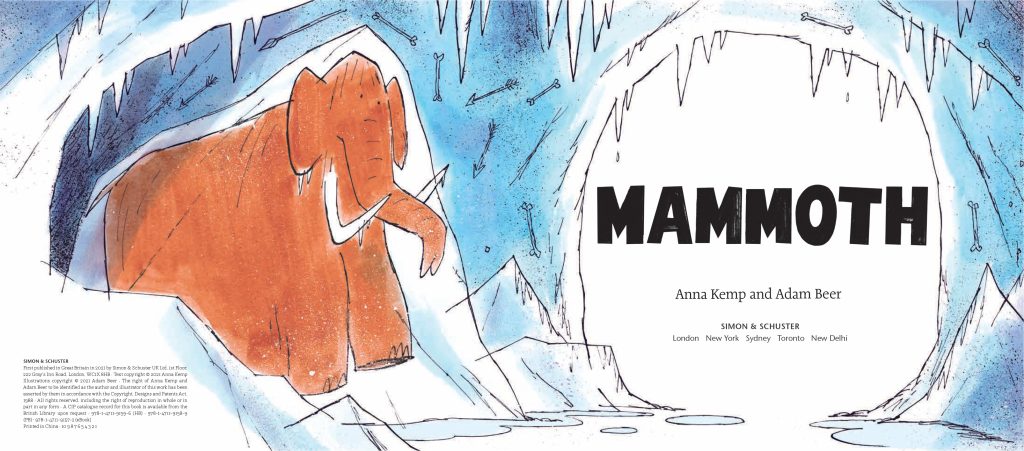
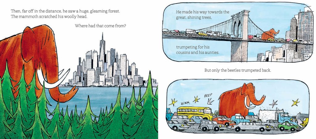
‘Mammoth’ was written by the amazing Anna Kemp and published in 2021 by Simon & Schuster. It tells the story of a Mammoth who gets thawed out after being frozen stiff since the ice age. He then sets out to look for his herd, only to find himself lost and alone in New York! After a lot of false starts and little adventures he finds a new family of friends in the big city. I really enjoyed making the illustrations for this book and learned a lot along the way. The team at Simon & Schuster, especially my Art Director and Editor, were really supportive – full of great ideas and technical advice. Mammoth made the shortlist for the Klaus Flugge prize for picture book illustration (and is available to buy in all the usual places).
Getting the gig
I was really lucky with how the book came about. At the opening night of my MA graduation show I met an editor from Simon & Schuster. She was really nice about my portfolio and we had a great chat. But opening nights are always hectic (and there was a lot of wine), so I just thought ‘Oh that was lovely, I have some useful feedback and maybe a new contact in the industry. Great!’
Unbeknownst to me, a few days later, the editor returned to the show with the fabulous writer Anna Kemp. Anna is the author of Dog’s Don’t do Ballet, The Worst Princess, Into Goblyn Wood and many more wonderful books. My portfolio got the thumbs up and within a couple of weeks I was discussing contracts with Simon & Schuster for my first book!
Research & Procrastination
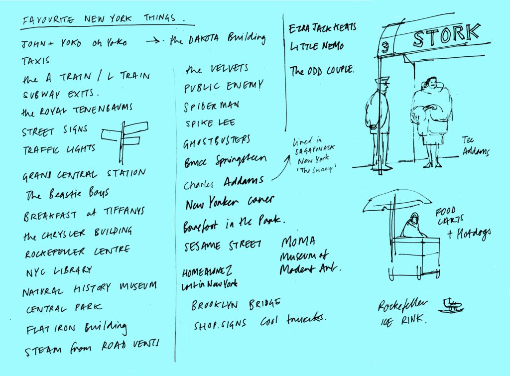
Once I got hold of the script I started doing research and making notes straight away. I had never made a picture book before and finding nice reference images of New York and mooching about on the internet was a great way to dodge doing actual work. Here are my procrastination highlights:
1). Wrote a long list of all my favourite New York things – Brooklyn Bridge, The Beastie Boys, Public Enemy, Central Park, Breakfast at Tiffanys, The Chrysler building, etc. etc.
2). Bought some really nerdy books about mammoths. Never read them, but I did look at the pictures.
3). Made a huge Pinterest board of New York images that I never looked at again. After talking to other illustrators this seems to be standard practice. You find the Pinterest board again at the end of the project and go; ‘ohhhh I should have done that instead!’
4). Made an epic Spotify playlist which you can listen to here.
All total procrastination of course! The most useful bit of research I did was digging out some of my own photos from a trip to New York I made in 2011. I think using your own photo reference is much more helpful generally. You can find interesting details that definitely won’t pop up on an internet search. A trip to the library or secondhand bookshops are just as good I think. Now it was time to get the sketchbooks out as deadlines were looming.

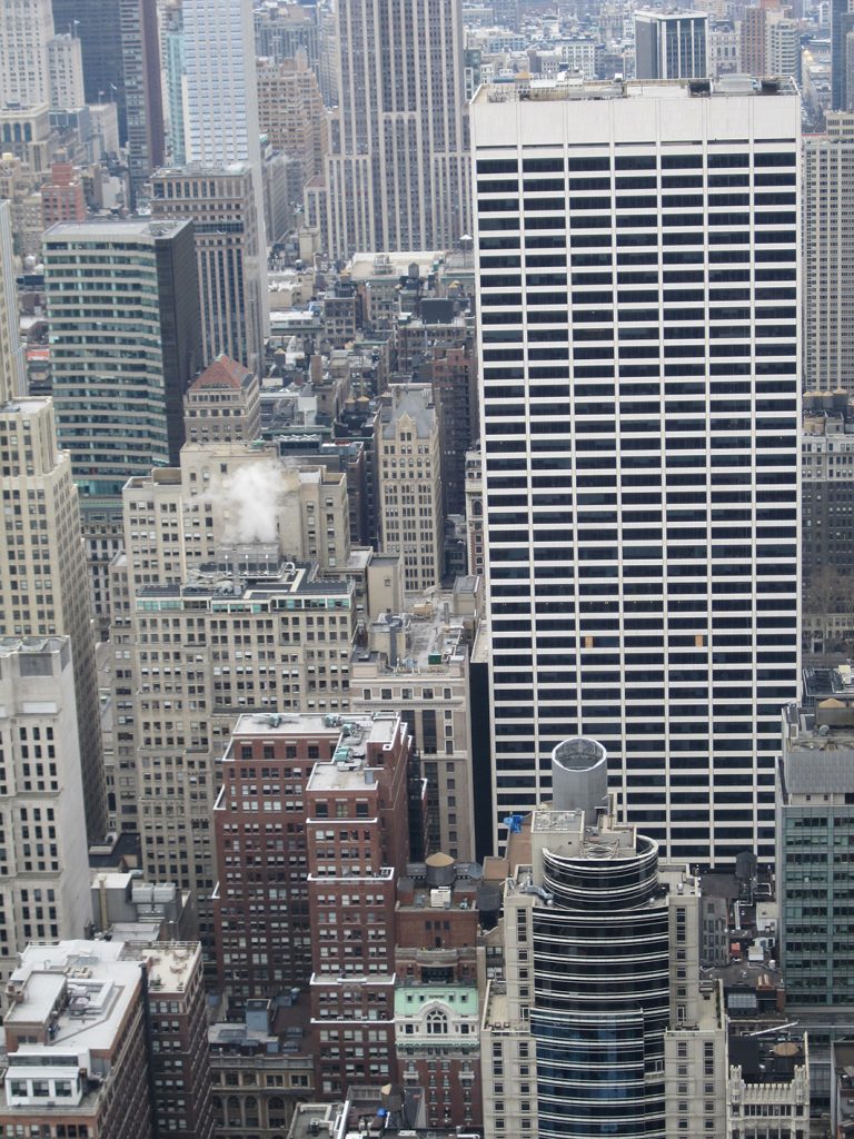
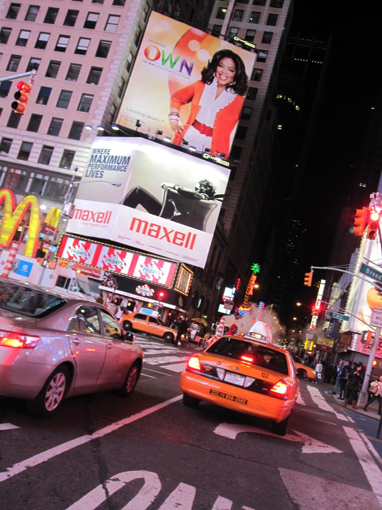
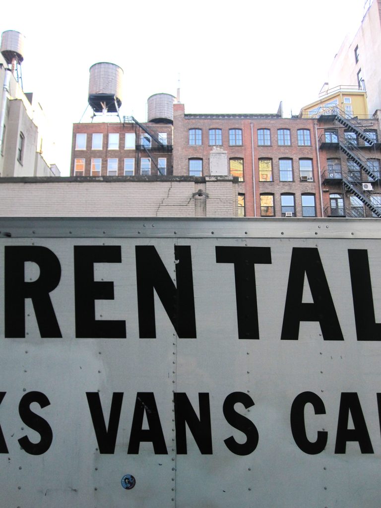
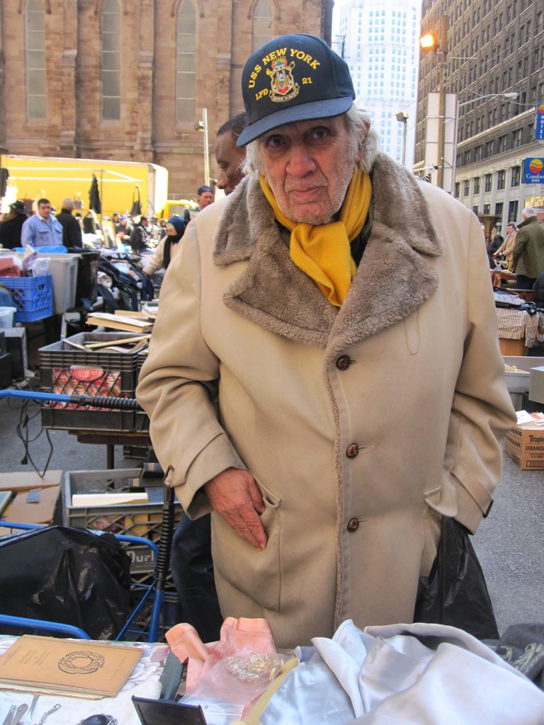
New York, 2011
Sketchbooks
I tried very hard to do all my development work in sketchbooks but it’s not always practical is it? I think working in sketchbooks was definitely useful for me, a great way to organise my thoughts and make mistakes. They were also handy to take in to show my publisher at meetings, especially as we had never worked together before. It was a good way to show them a peak into my brain.
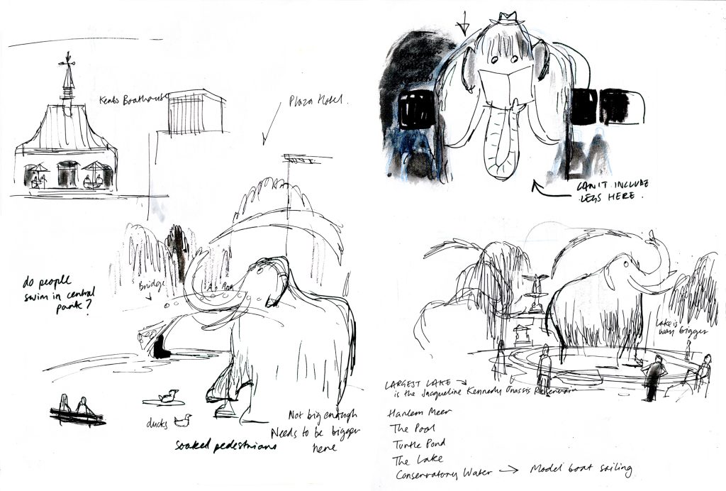
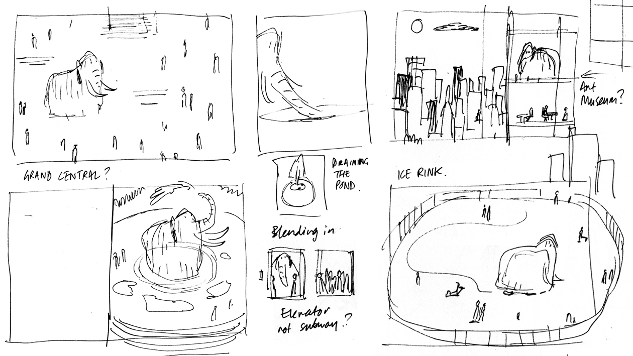
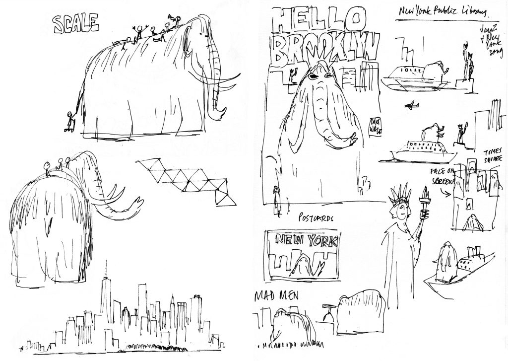
Thinking about scale and NYC locations 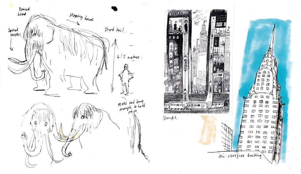
Sketches and a Sempe illustration for inspiration! 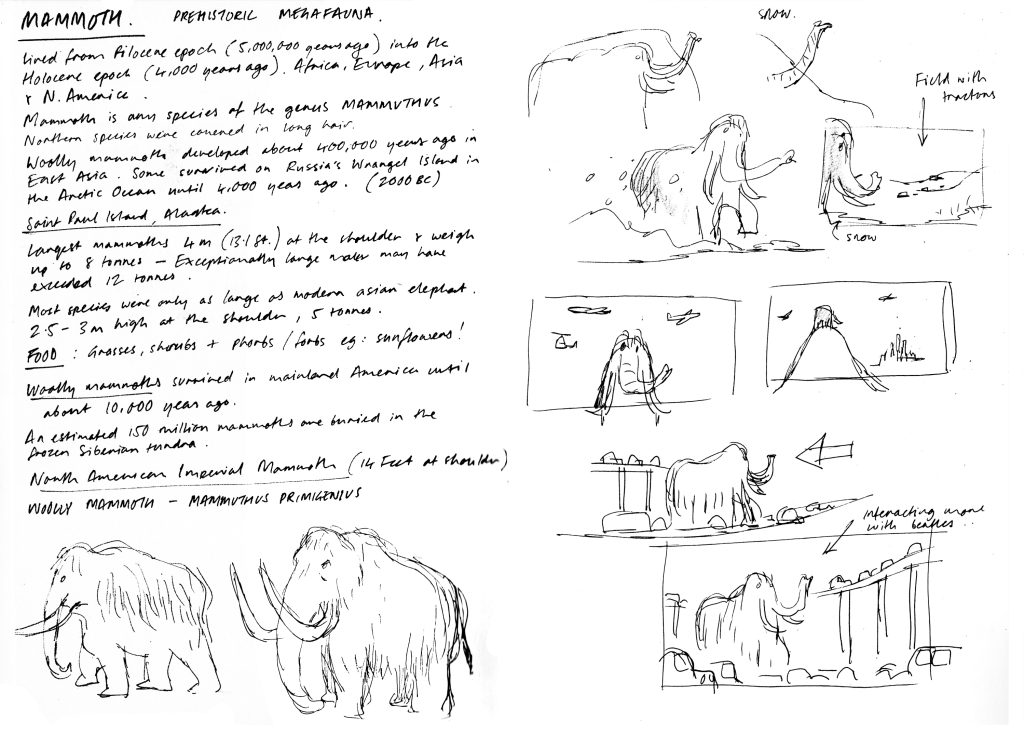
Mammoth facts! 14 feet tall and weighing in at 8 tonnes! Big boys. 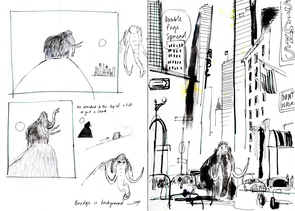
Early layout sketches
Editors and Art Directors are really used to looking at sketchbooks so don’t be shy in showing them. Also they might spot something in there that you have completely overlooked. Looking back at my sketchbooks I can see myself loosening up as they progress. And I think there are some layout ideas in there that I can use in future projects.
Mammoth Design
I’m really pleased with how the mammoth ending up looking, he’s such a simple shape. But it took me a long time to find something I was happy with. Mammoths head shapes are strange and you have these awkward tusks to contend with. Plus they are enormous!
Number one for me was putting away the distracting reference images and boring books about mammoths. And number two was drawing the mammoth in different environments and situations, and interacting with other characters. I find that when you put a character into different situations and environments, it forces you into making design decisions about them. Like playing on a basketball court with tiny humans or sitting at a restaurant counter when you’re a 20 foot tall wooly mammoth. It’s going to affect everything (and everyone) in the environment and it’s going to affect the character’s posture and attitude.
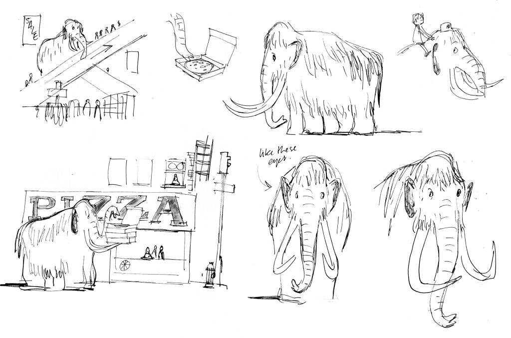
Riding elevators and eating pizzas 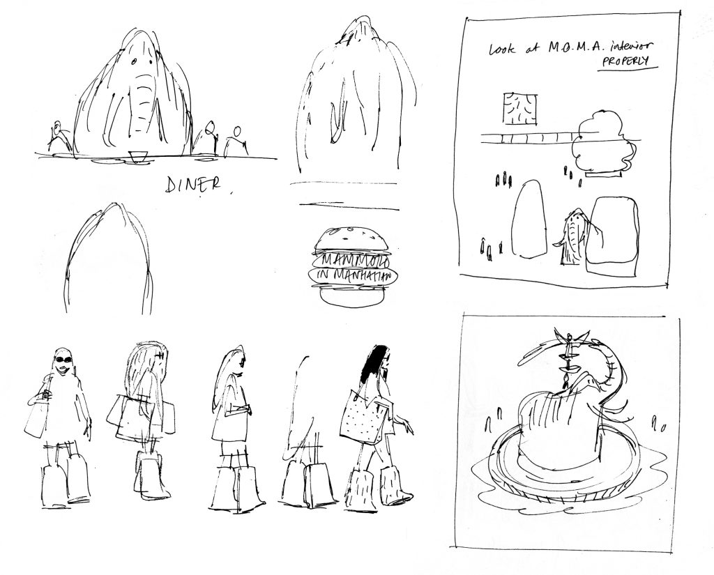
Diners, fountains and furry boots 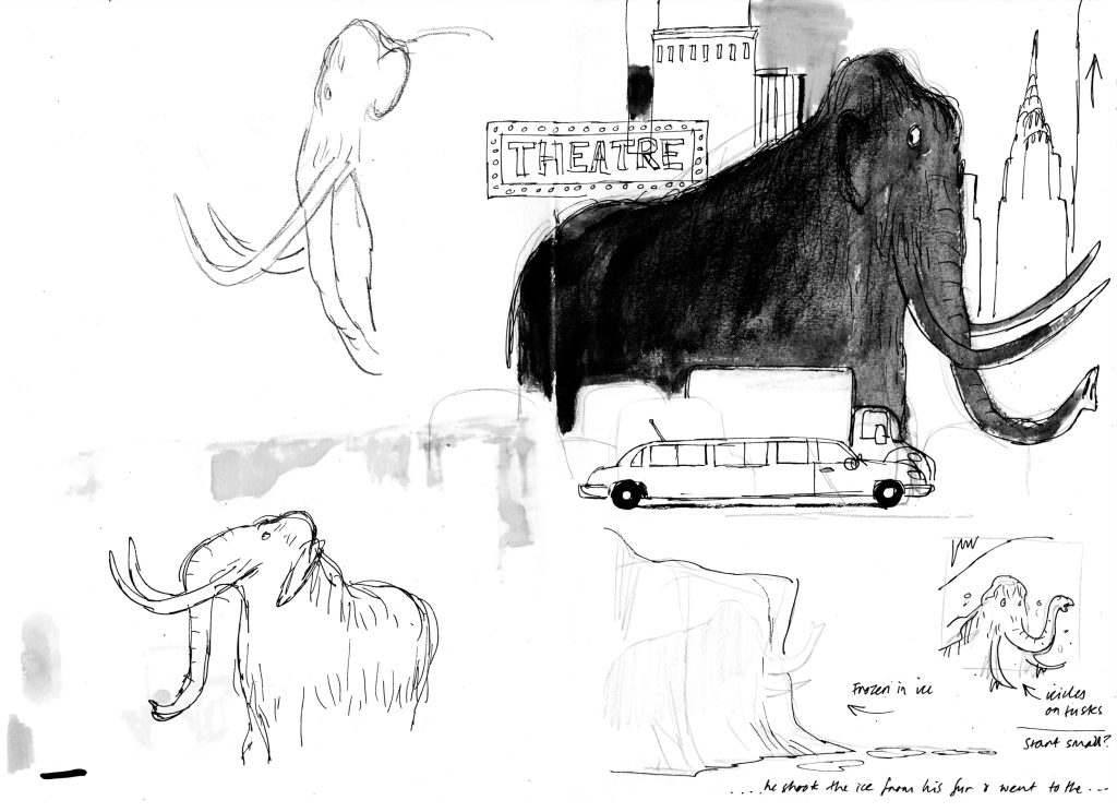
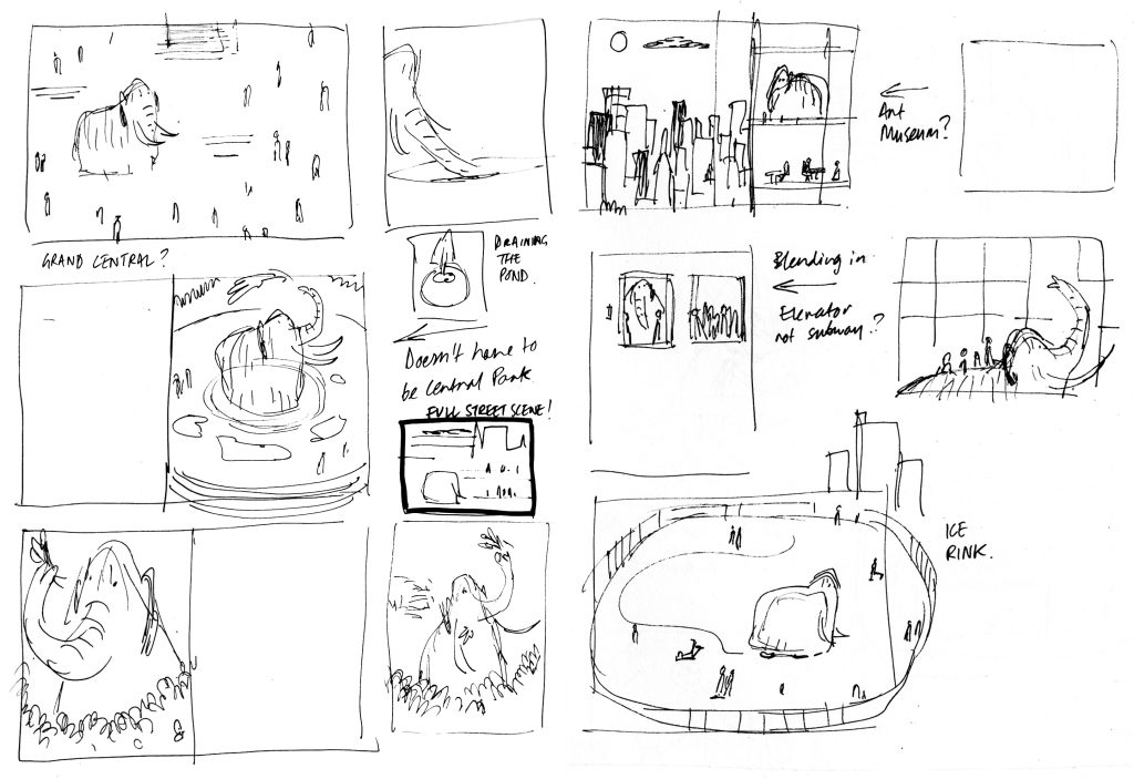
Starting to think about spreads and page design.
Once I started sketching the mammoth in lots of different situations it made the character design process much more fun, almost like a byproduct of drawing these little scenes. Looking at him from different angles and thinking about how he would react and feel in these situations helped me to sculpt and simplify the shape of him. It was a win win. You’re thinking about the character and you’re thinking about the environment and creating these funny situations all at the same time.
Thanks for reading – Part 2 will follow soon….